Landing Page · Web Design
BNI Syariah — Landing Page Design
Landing Page · Web Design
-ChCnGWHu.png)
Designed a landing page for BNI Syariah, one of Indonesia's leading Islamic banks. The goal was to create a clean, trustworthy, and informative web presence that communicates the bank's products and values clearly to prospective customers.
01 / Project Brief
Purpose, Role & Challenges
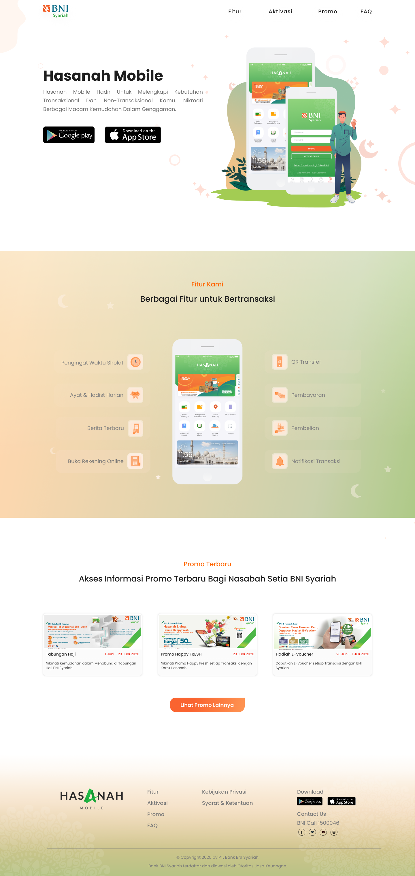
Purpose
- →Create a clean, trustworthy web presence for an Islamic bank
- →Communicate products and services clearly to prospective customers
- →Drive conversions through clear CTAs and intuitive navigation
My Role
- →Landing page UI design
- →Visual hierarchy and layout design
- →Component design and style guide
- →Design Handoff to frontend team
Challenges
- →Balancing regulatory information with clean visual design
- →Building trust and credibility through visual language for a financial institution
- →Designing for a broad audience — from tech-savvy users to first-time digital bank visitors
02 / Process
Design Process
Research & Requirements
Early 2020Analyzed competitor landing pages of Indonesian banking institutions and gathered content requirements from stakeholders.
- ·Competitor analysis (BCA, Mandiri Syariah, BSI)
- ·Content requirement gathering
- ·Target audience definition
UI Design & Handoff
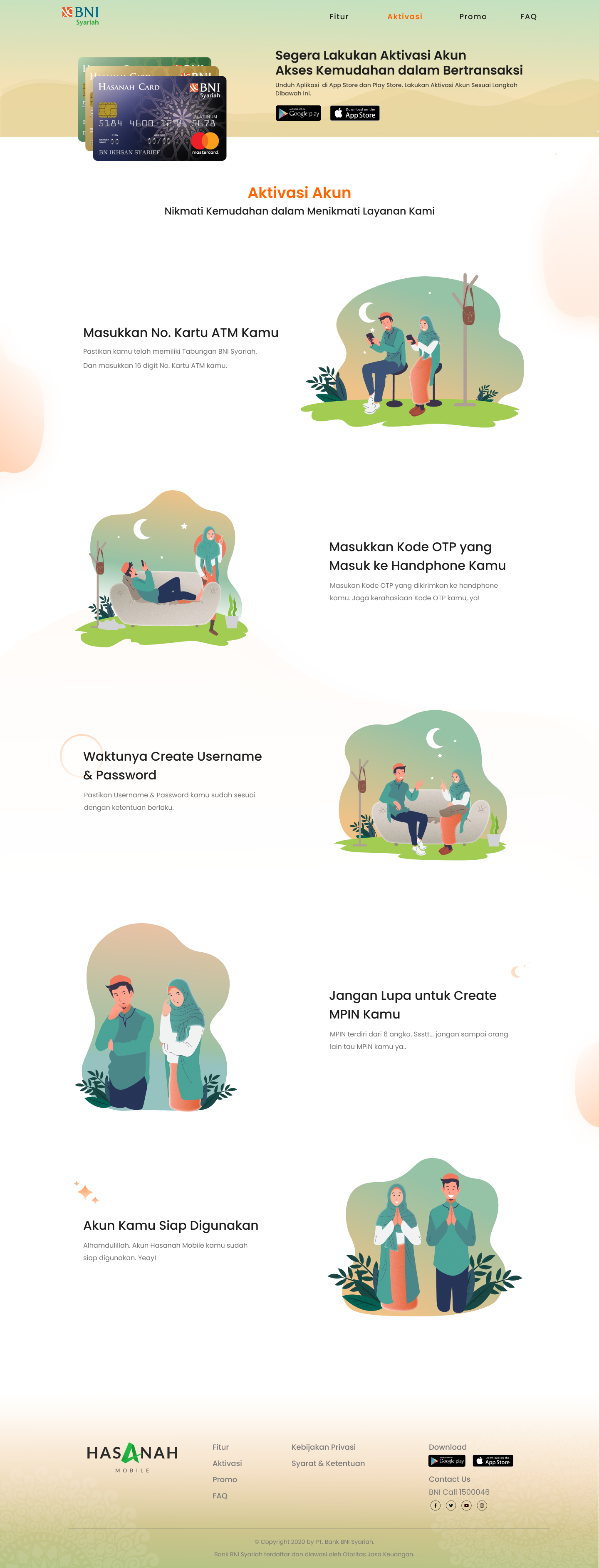
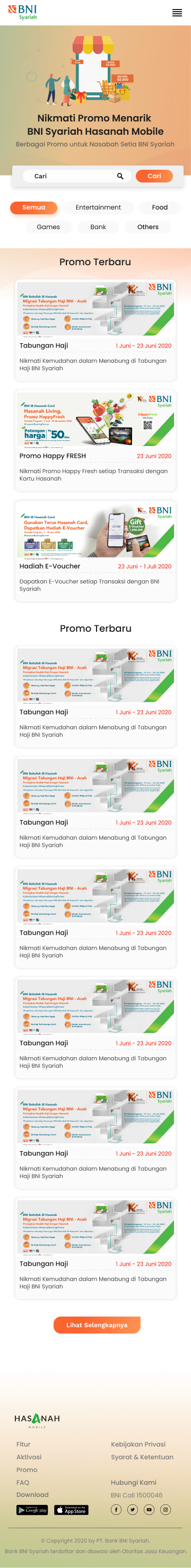
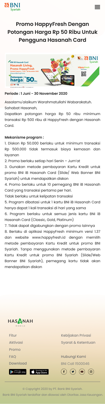
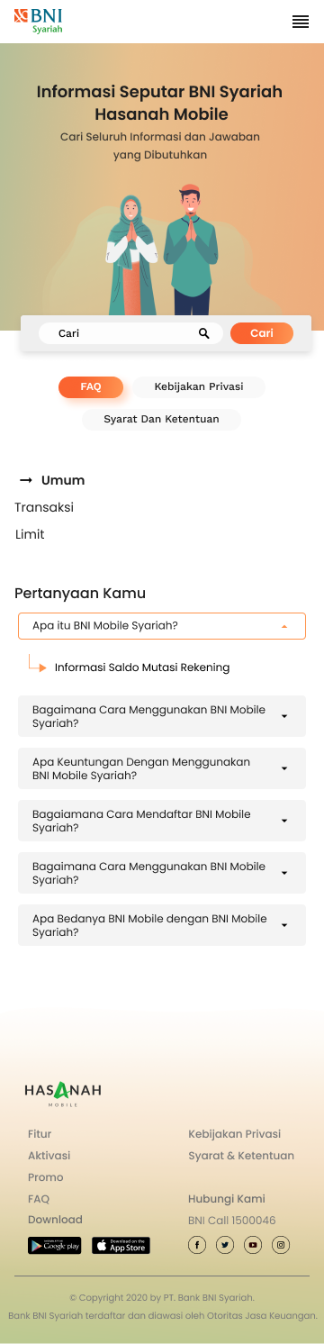
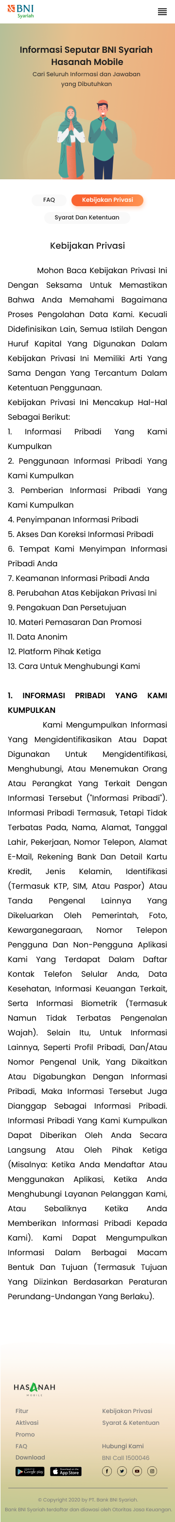
2020Designed the full landing page including hero section, product cards, promo banners, FAQ, and responsive mobile layouts. Delivered via Figma with full specs.
- ·Hero section with clear value proposition
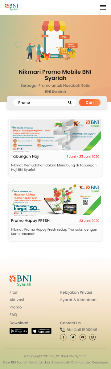
- ·Product & promo card design
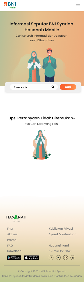
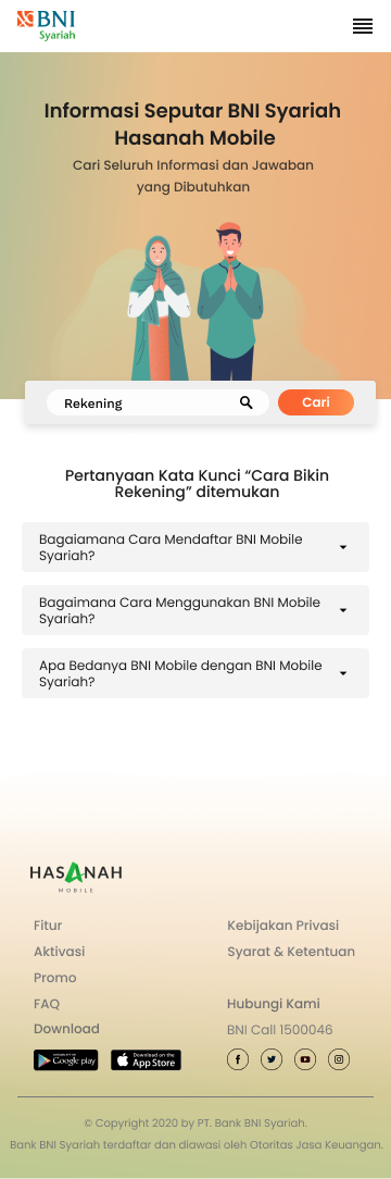
- ·FAQ section design
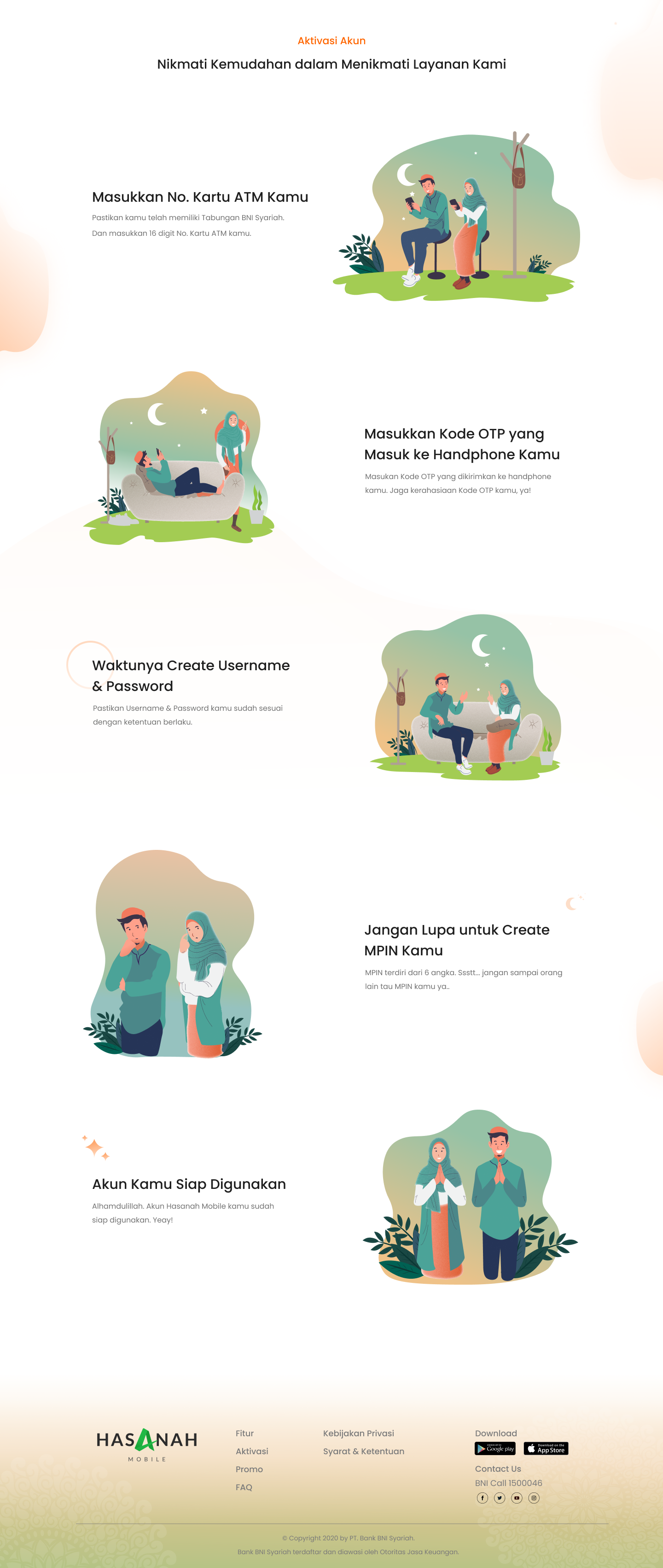
- ·Mobile-responsive layouts
- ·Figma handoff with annotations
03 / Flow
User Flow — First Visit to Account Opening
Designed the landing page to guide first-time visitors from awareness to account opening intent.
Example: First-time visitor journey
Positive Flow
- 01Land on hero section → clear value proposition
- 02Scroll to product overview → explore offerings
- 03Read promo section → triggered by offer
- 04Click CTA → directed to account opening
Negative Flow
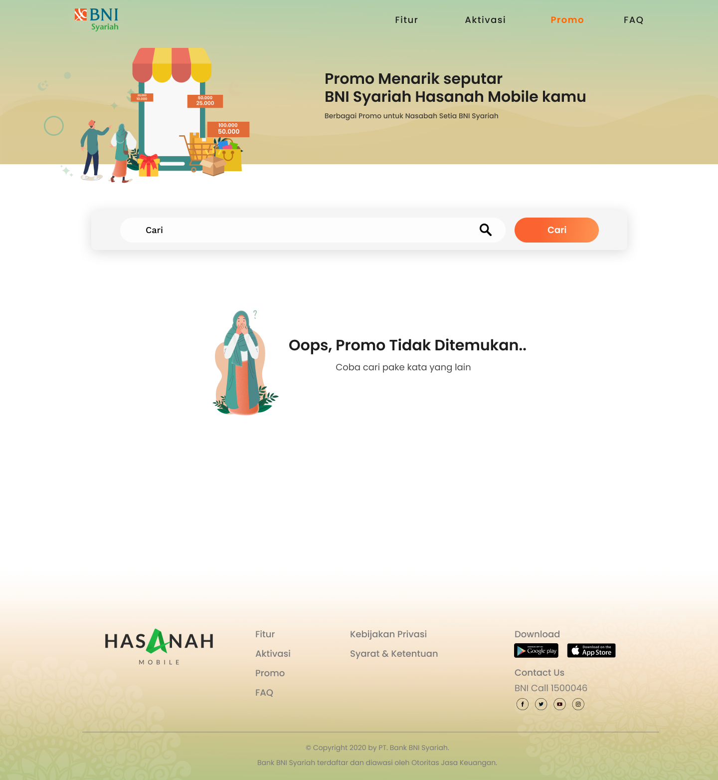
- ✕User confused by product → FAQ section provides clarity
- ✕User not ready to open account → social proof + promo nudges
- ✕Mobile user → responsive layout ensures no info is lost
04 / Learnings
Key Learnings
01
Trust is the #1 design constraint for financial products
Color, typography, and layout choices all needed to reinforce credibility — not just aesthetics.
02
Information hierarchy drives conversion
Clear visual hierarchy from hero to CTA reduced cognitive load and guided users toward intended actions.
05 / Outcome
Results & Impact
Responsive
100%
Mobile-First Design
All layouts designed with mobile-first approach ensuring consistent experience across devices.
Delivery
On-time
On-Time Delivery
Full design delivered within scope and timeline with clean handoff documentation.
06 / Gallery
Visual Gallery
Web Dashboard · 7 screens
Mobile App · 9 screens

Tools
See more work on
Dribbble ↗