Web App · Redesign
Enhancement Flow KAI Wisata
Web App & Mobile · UX Enhancement · Redesign
Redesigned and enhanced the user flow for KAI Wisata — PT KAI's tourism booking platform. The project focused on improving the end-to-end booking experience across train tickets, hotel reservations, and payment flows for both web and mobile.
01 / Project Brief
Purpose, Role & Challenges
Purpose
- →Simplify the booking flow for train tickets and hotel reservations
- →Improve payment and checkout experience
- →Create consistent UI across web and mobile platforms
My Role
- →User flow analysis and redesign
- →Web and mobile UI design
- →Booking, ticket, and payment screen design
- →Design handoff to engineering team
Challenges
- →Complex multi-step booking flow that caused user drop-off
- →Inconsistent UI patterns between web and mobile versions
- →Tight timeline requiring efficient design decisions
02 / Process
Design Process
Flow Analysis & Research
Early 2020Audited the existing booking flow to identify friction points and drop-off stages in the user journey.
- ·Existing flow audit and heuristic evaluation
- ·Competitor analysis of travel booking apps
- ·Key friction point identification
UI Design — Web & Mobile
2020Designed the full booking experience including listing, detail, login, ticket, hotel, and payment screens for both web and mobile.
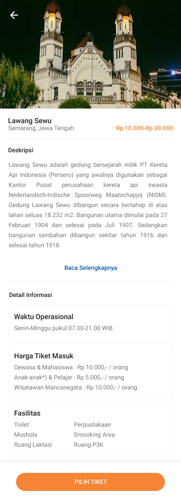
- ·Train ticket listing and detail screens
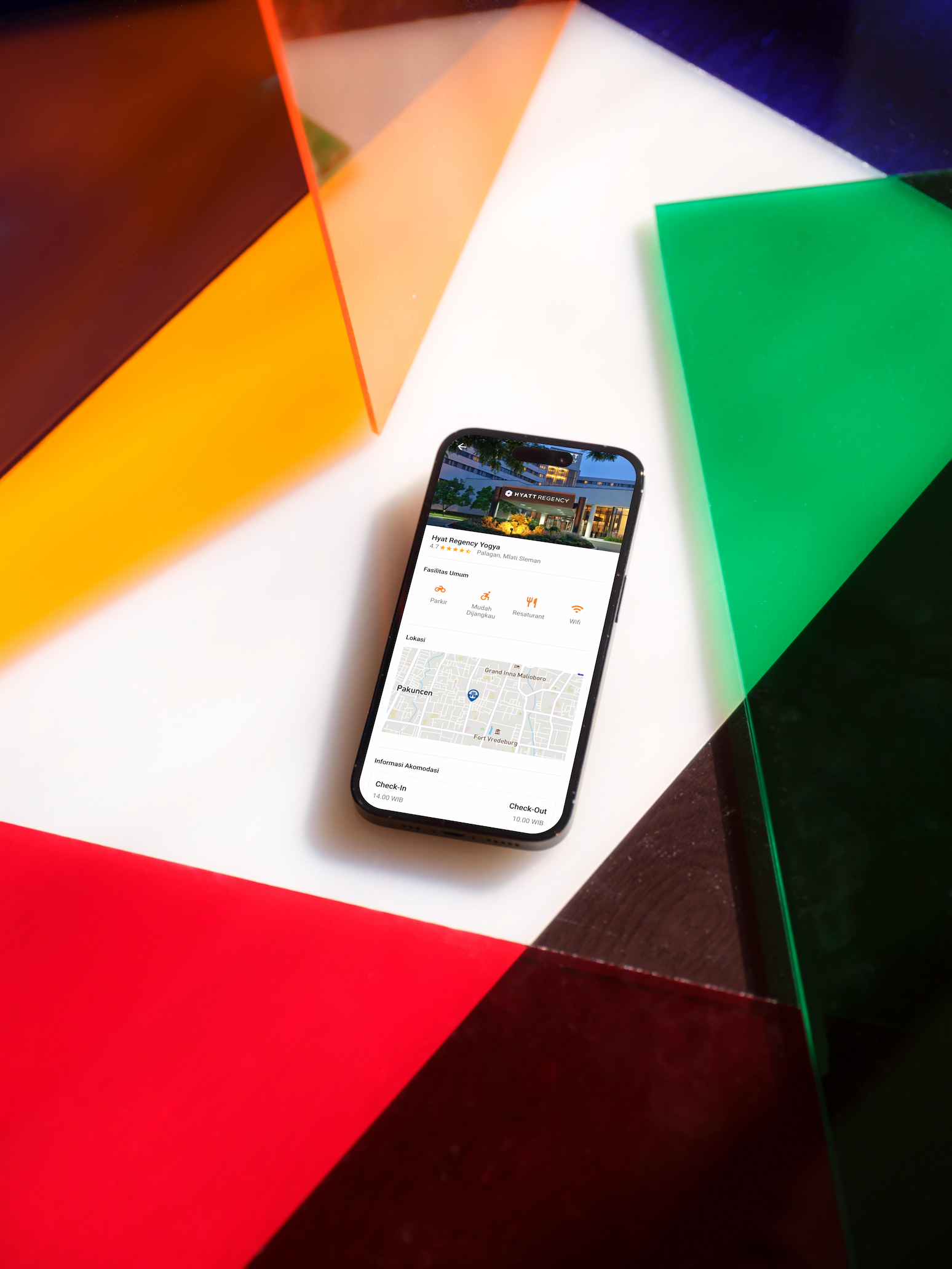
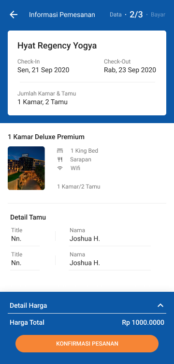
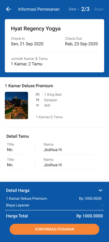
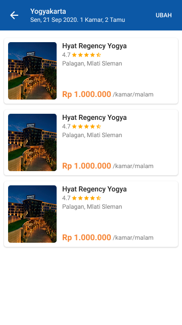
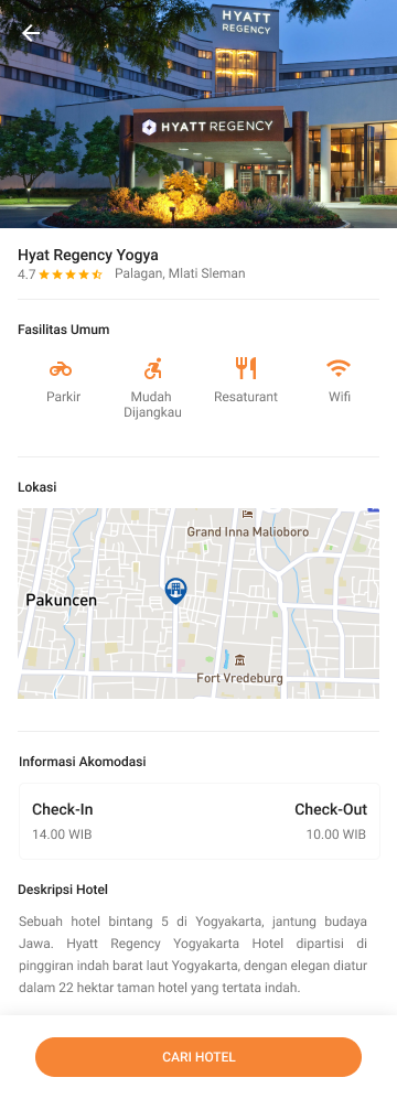
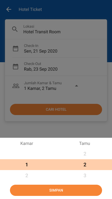
- ·Hotel listing, detail, and booking flow
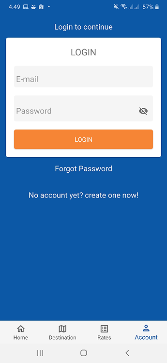
- ·Login and authentication screens
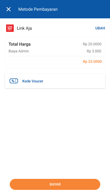
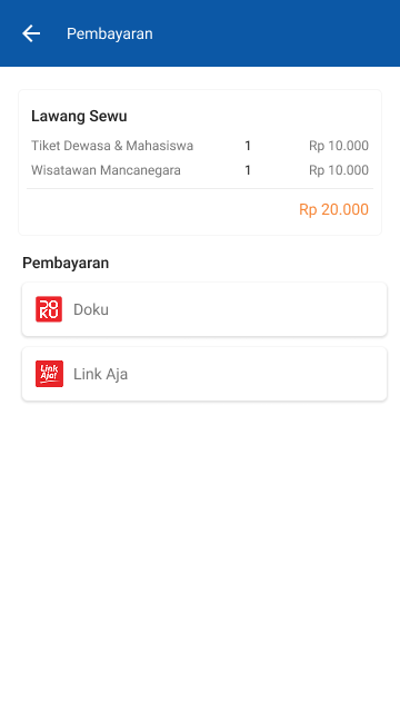
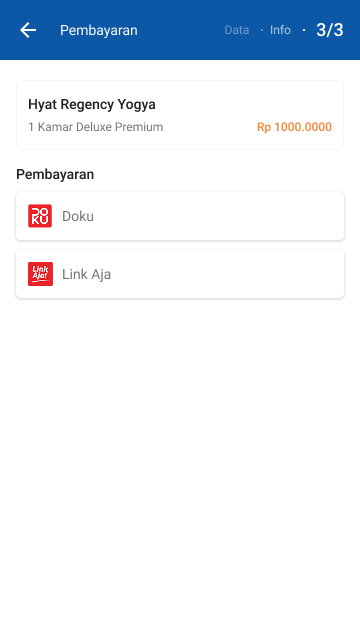
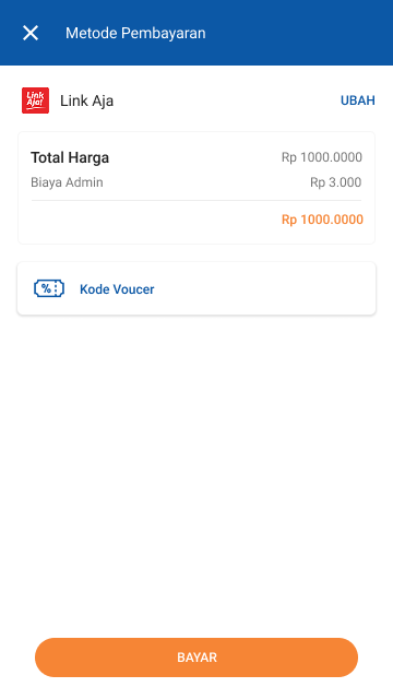
- ·Payment and checkout flow
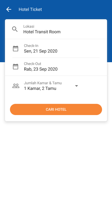
- ·Hotel ticket confirmation screens
- ·Mobile companion screens
03 / Flow
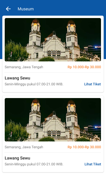
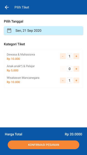
Flow — Train Ticket Booking
Streamlined the ticket booking flow to reduce steps and cognitive load.
Example: Train ticket booking journey
Positive Flow
- 01Search train → results list
- 02Select ticket → view detail
- 03Confirm booking → proceed to payment
- 04Payment success → ticket confirmation
Negative Flow
- ✕No availability → suggest alternative dates
- ✕Payment failed → retry with clear error message
- ✕Session expired → redirect to login with context preserved
04 / Learnings
Key Learnings
01
Simplicity in multi-step flows reduces drop-off
Breaking complex booking steps into clear, focused screens significantly improved completion rates.
02
Consistency across platforms builds trust
Aligning the web and mobile visual language helped users navigate confidently across both platforms.
05 / Outcome
Results & Impact
Booking completion
↑↑
Improved Booking Flow
Simplified multi-step flow reduced friction and improved booking completion.
Responsive
100%
Web & Mobile Consistency
Unified design system across web and mobile ensured consistent user experience.
06 / Gallery
Visual Gallery
Tools
See more work on
Dribbble ↗