Dashboard · IoT · Smart Building
Polytron Smart Building Power Monitoring System
Web Dashboard & Mobile App · IoT · Smart Building
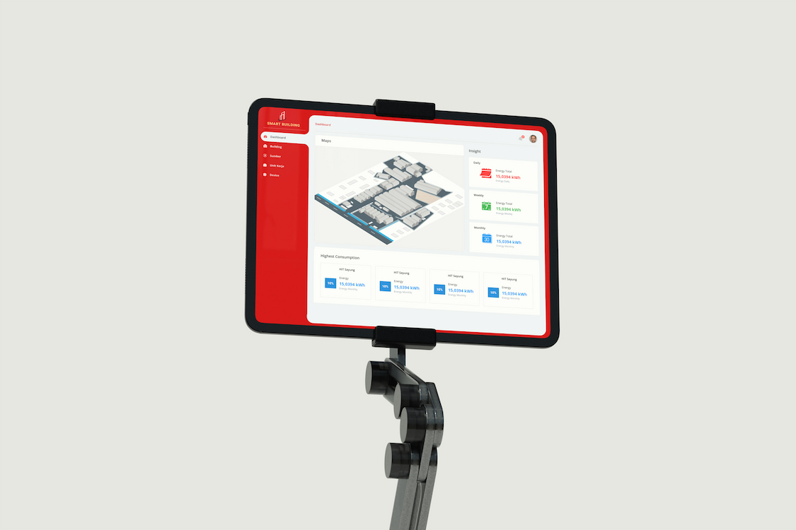
Designed a web and mobile UI for an IoT-powered smart building power monitoring platform at Polytron R&D. The system enabled facility managers to monitor real-time energy consumption across buildings, detect anomalies, and drill down from building level to individual devices.
01 / Project Brief
Purpose, Role & Challenges
Purpose
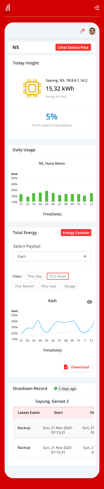
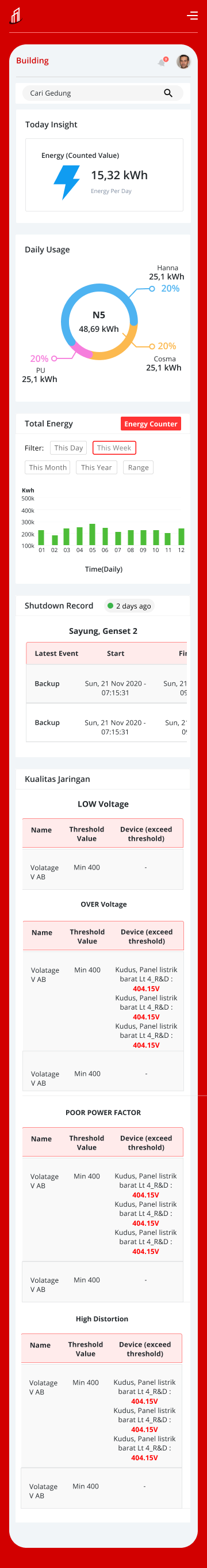
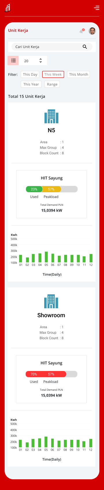
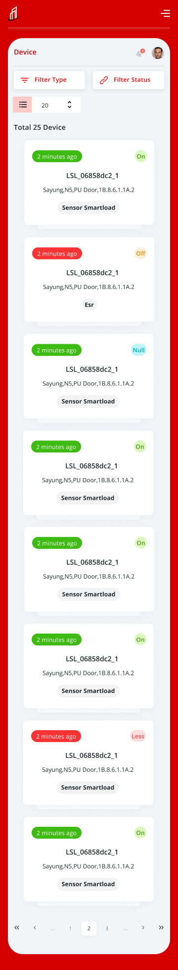
- →Granular visualization — drill down from whole plant to individual devices (HVAC, lighting, machines)
- →Real-time anomaly detection with instant alert notifications
- →Comparative analysis across time periods and buildings to identify energy-saving opportunities
- →Operability — fast access to critical information from within massive datasets
My Role
- →Information Architecture (IA)
- →Dashboard data visualization design
- →Hierarchical navigation structure
- →Design Handoff with technical specs for engineering team
Challenges
- →Visualizing large volumes of IoT sensor data without overwhelming users
- →Designing drill-down navigation from building → floor → device level
- →Balancing information density with clarity for on-site operators
- →Designing for physical constraints: bright factory floors, mobile use in field
02 / Process
Design Process
Discovery & Requirements
Apr 2020Conducted stakeholder interviews and on-site observation at Polytron factories to understand operator workflows and pain points with the existing manual monitoring process.
- ·Stakeholder interviews with facility managers
- ·On-site observation of monitoring workflows
- ·Competitive analysis of existing IoT dashboards
- ·Defined key user scenarios
Information Architecture & Navigation
May 2020Built a hierarchical IA — Building → Floor → Zone → Device — and designed drill-down navigation that lets operators find and act on anomalies within seconds.
- ·Hierarchical site map: Building → Floor → Zone → Device
- ·Drill-down navigation flow design
- ·Alert & notification IA
- ·Mobile-first responsive structure
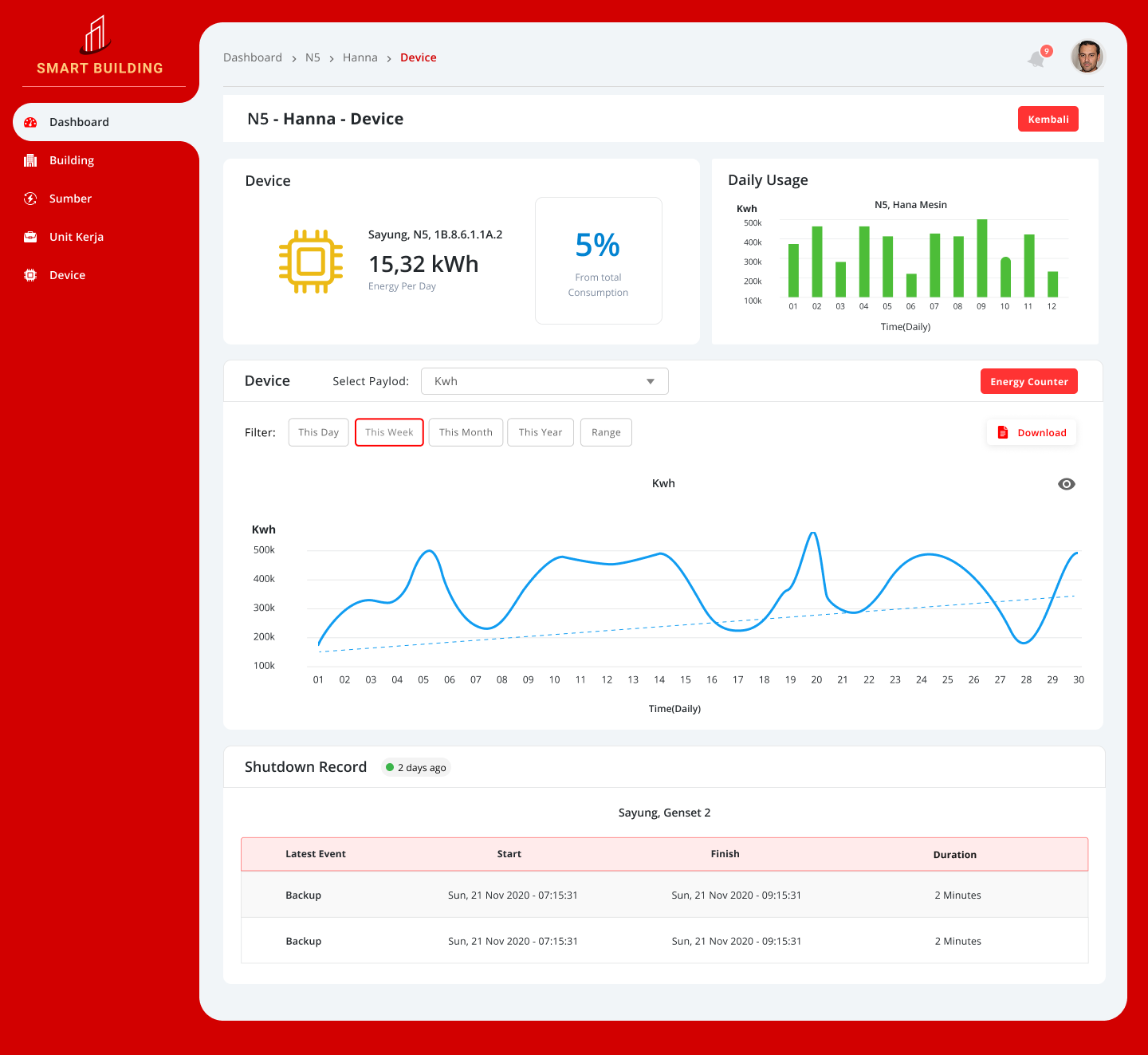
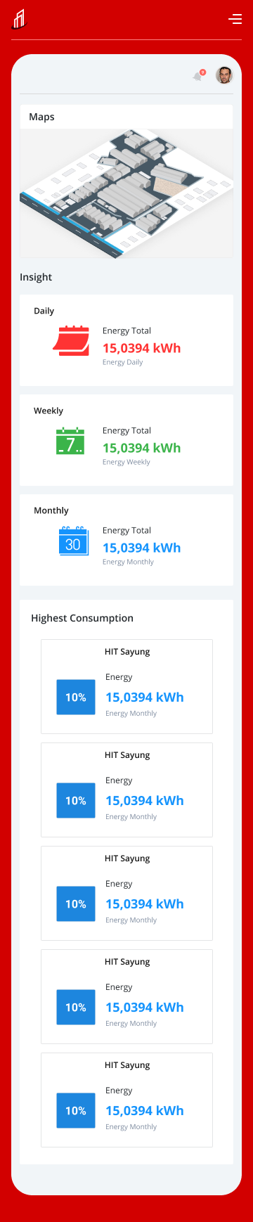
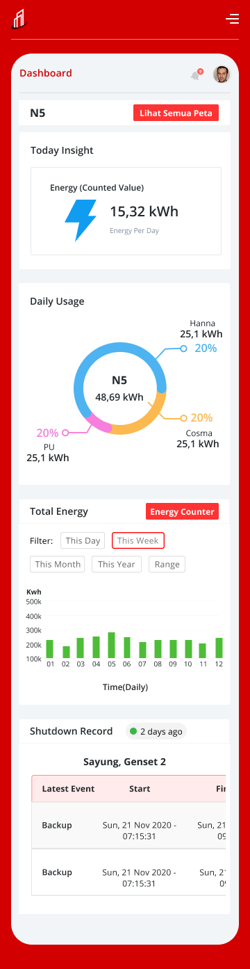
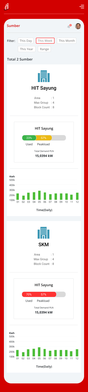
UI Design — Web & Mobile
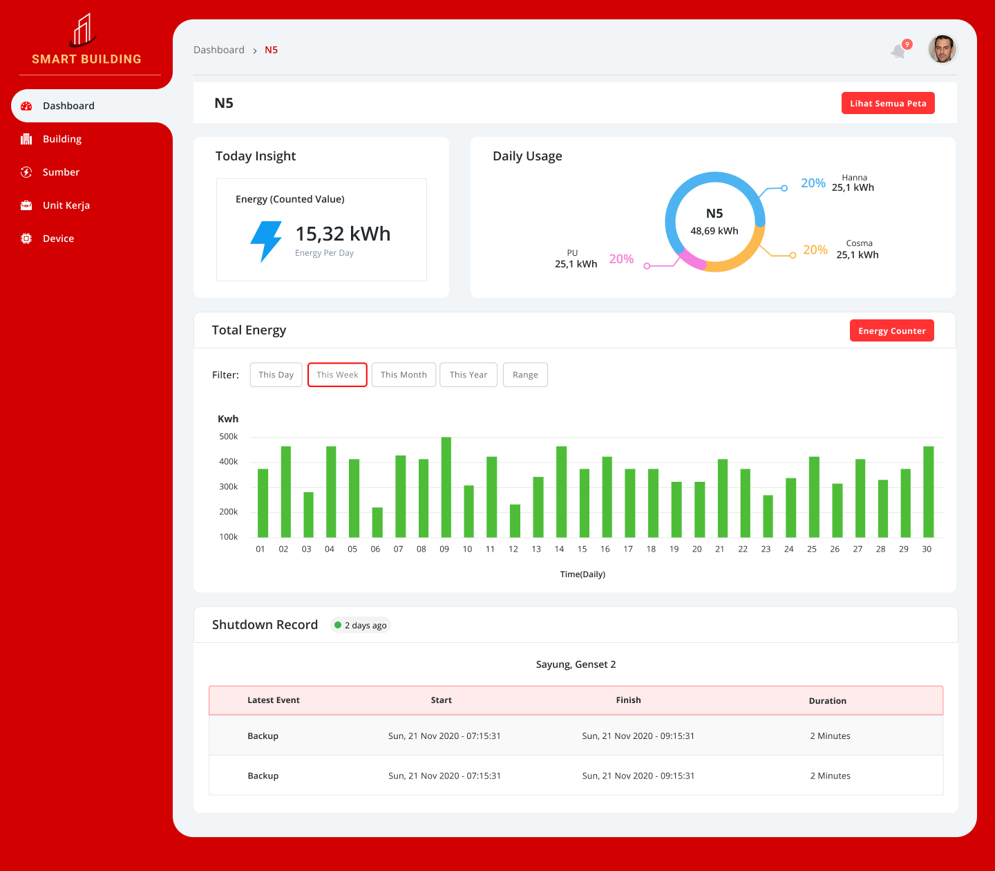
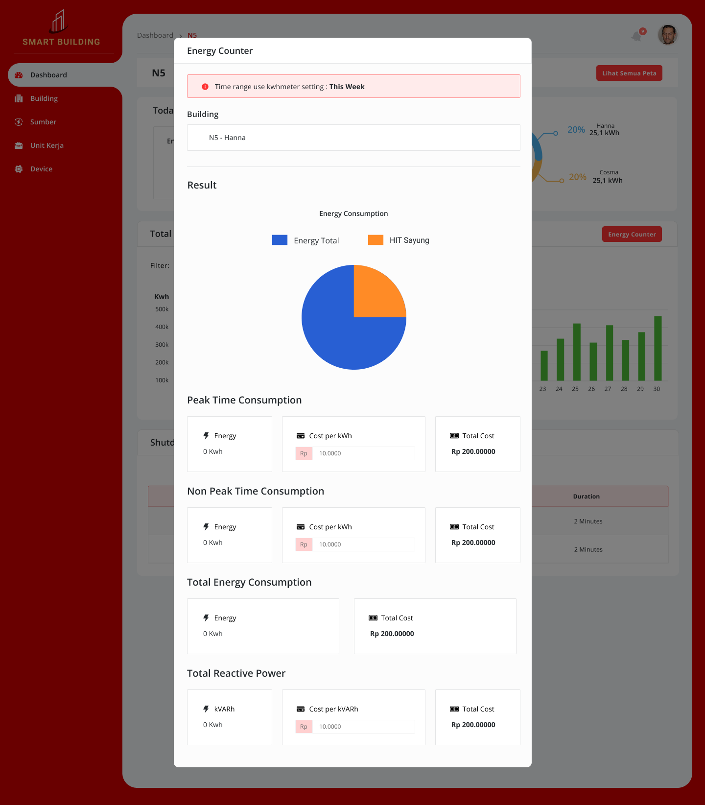
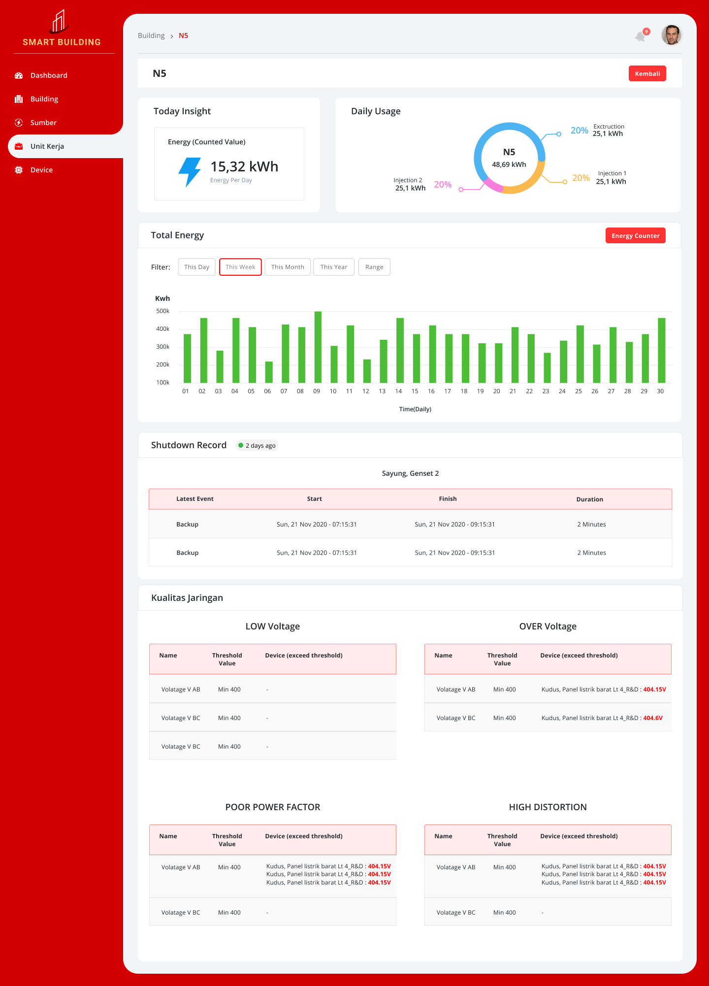
Jun – Aug 2020Designed the web dashboard and companion mobile app. Data visualization used charts and heatmaps to surface anomalies quickly. High information density was balanced with clear hierarchy for factory-floor legibility.
- ·Real-time energy consumption charts & heatmaps
- ·Anomaly alert cards with severity levels
- ·Device-level detail screens
- ·Mobile companion app for field operators
- ·Design System: color, typography, chart components
Handoff & QA
Sep 2020Delivered full design specs to the engineering team via Figma with annotations, component states, and responsive breakpoints. Conducted UI QA post-implementation.
- ·Figma handoff with full annotation
- ·Component state documentation
- ·Responsive breakpoint specs
- ·Post-implementation UI QA
03 / Flow
Flow Design — Alert Detection & Response
Designed both the normal monitoring flow and the anomaly response path to ensure operators can act on alerts within seconds.
Example: Power Anomaly Detection
Positive Flow
- 01Dashboard shows all-green status
- 02Operator drills down to check floor/zone detail
- 03Consumption within normal range → no action needed
- 04Data logged for comparative analysis
Negative Flow
- ✕Anomaly detected → red alert card appears on dashboard
- ✕Operator taps alert → drill-down to affected device
- ✕Device detail shows spike timestamp + severity
- ✕Operator marks issue → maintenance team notified
- ✕Post-resolution: data logged for pattern analysis
04 / Learnings
Key Learnings
01
Redefining 'ease of use' for industrial contexts
Great design isn't just aesthetically minimal — it must deeply understand the user's context, including on-site conditions and cultural factors.
02
Japanese users prefer information density over whitespace
Japanese users tend to prefer information-rich, well-organized UIs that convey reliability — over minimalist layouts with lots of whitespace.
03
Physical constraints must inform design
Designing for factory-floor conditions — bright lighting, glare, mobile use — required going beyond desk-based assumptions to real physical constraints.
04
Hierarchy is the core UX principle for IoT dashboards
When data volume is enormous, the user's ability to drill down quickly and accurately is the single most important design decision.
05 / Outcome
Results & Impact
Energy cost reduced
15%
Energy Cost Reduction
Early detection of excessive consumption by specific devices enabled ~15% reduction in overall energy costs within 3 months of deployment.
Downtime reduced
20%
Maintenance Efficiency
Anomaly detection alerts enabled early identification of equipment failure signs, reducing downtime by 20%.
Decision speed
↑↑
Faster Decision Making
Complex data organized visually allowed managers to assess situations and generate reports significantly faster.
06 / Gallery
Visual Gallery
Web Dashboard · 4 screens
Mobile App · 7 screens
Tools
See more work on
Dribbble ↗