Case Study — 2021
Reading every app-store review to rebuild a news app's navigation
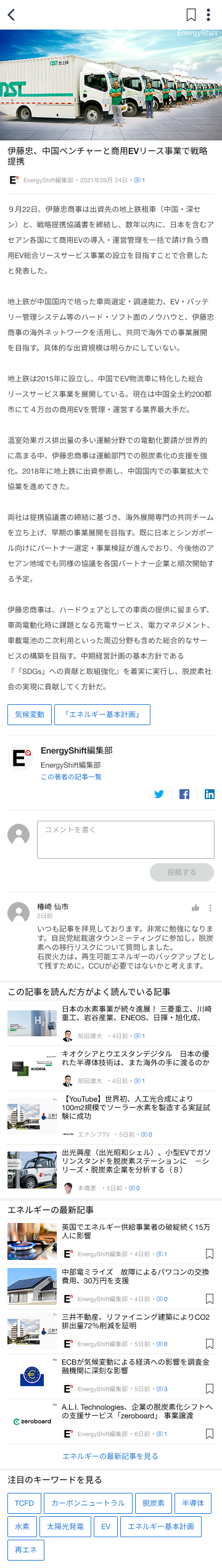
Energy Shift is a renewable-energy news app by AfterFIT. With 4 months as a solo intern designer and no access to user interviews, I used app-store reviews, academic research, and competitive analysis to rebuild the app from its structure up.
Client
AfterFIT (Japan)
Role
Sole designer
Duration
4 months
Platform
iOS / Android
01 / The Problem
App-store reviews pointed to structural issues, not visual ones.
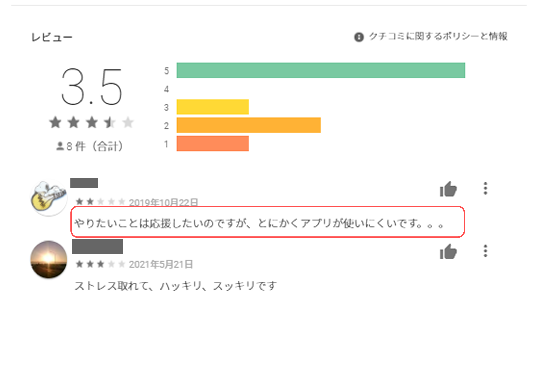
The brief was broad — improve the app. Before opening Figma, I read every single app-store review to identify what was actually broken.
I read for patterns, not sentiment. Different users, different phrasing, same complaint underneath — that's signal, not noise.
01
What I observed
The brief was broad — "improve the app." No specific pain point was given. So I opened Google Play and read every review — not for sentiment, but for patterns. What exact words kept repeating?
02
What I found
The complaints weren't "ugly UI" or "bad colors." They were: "I can't find anything," "hard to navigate," "confusing layout." Different users, same structural complaint — that's a signal, not noise.
03
My hypothesis (before any design work)
This isn't a visual problem. It's a structural one. The navigation isn't helping users find what they want. Restyling the app would waste everyone's time — the foundation needed to be rebuilt.
02 / Research
Before any design work, two research streams validated the diagnosis.
Hypothesis: navigation was the core issue. To test it, I ran two parallel streams — academic research on mobile news-app behavior, and a competitive analysis of five major Japanese news apps.
Academic research
SAGE / MIT — mobile news app behavior
- Users browse by category, not by searching
- If they can't find their topic on home, they leave fast
- Trending/ranking feeds are a strong discovery driver
Competitive analysis
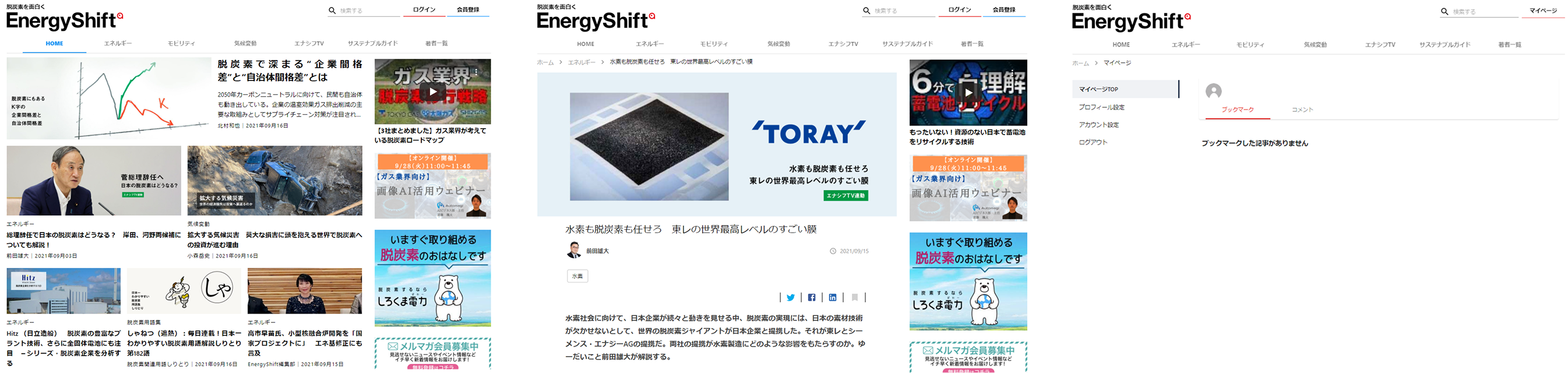
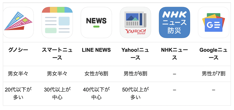
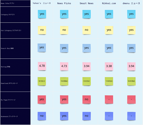
NHK · Yahoo! News · SmartNews · NewsPicks · Gunosy
- All 5 used bottom nav + category tabs
- Search was always in primary nav — never buried
- Trending/ranking was a standard feature in every app
- Home organized by clear content categories
03 / Diagnosis
Mapping the existing IA surfaced three structural problems.
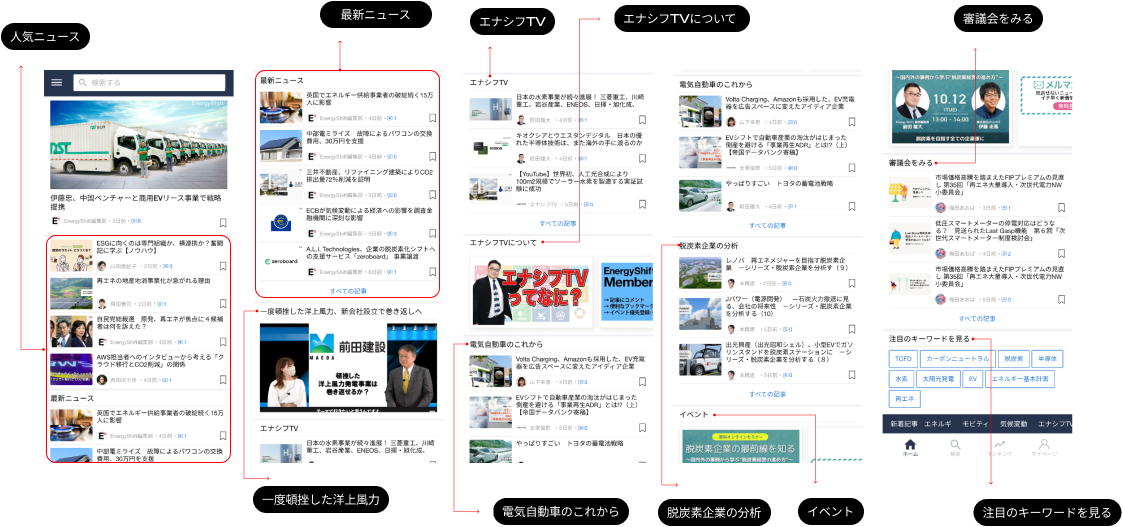
I mapped every screen and connection in the existing app. The exercise surfaced three distinct structural problems — each with a traceable cause and a corresponding design solution.
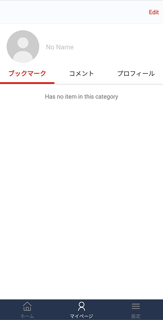
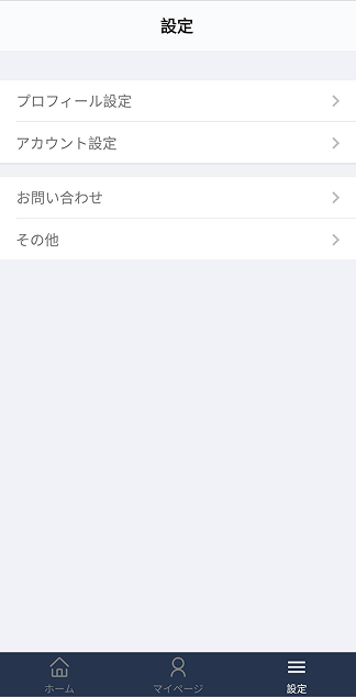
Problem 1 — Navigation
Search was buried at the same level as article pages
Users couldn't tell if they were in the main app or inside a sub-section. Search should always be reachable — it wasn't.
Fix → Moved search to permanent primary nav bar
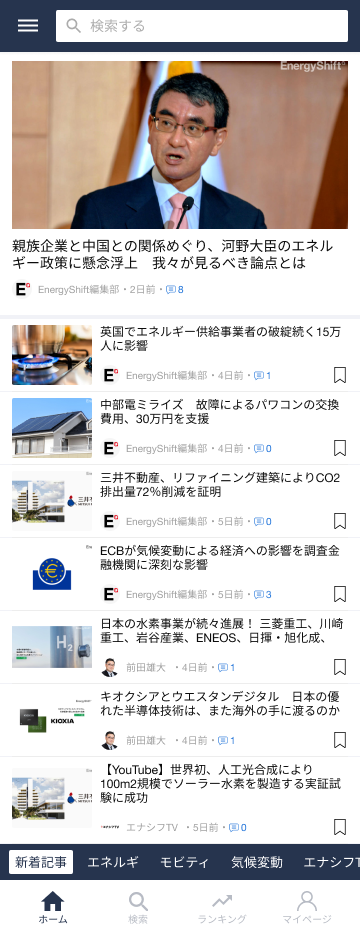
Problem 2 — Content structure
Every article on one screen, no grouping
The home screen was a flat list of everything. Users interested in "solar" had to scroll past "EV policy" and "wind power" to find it.
Fix → Rebuilt home as category tabs with sub-category drill-down
Problem 3 — Icon language
Custom icons users had never seen before
The app used non-standard icons. Users had to learn a new icon vocabulary just to navigate.
Fix → Replaced with standard iOS/Android news-app icon patterns
“The moment the IA was drawn, the vague navigation complaint in reviews became three clearly defined, traceable problems.”
— Reflection after the IA mapping
04 / Design Decisions
Every design change traces back to a specific structural problem.
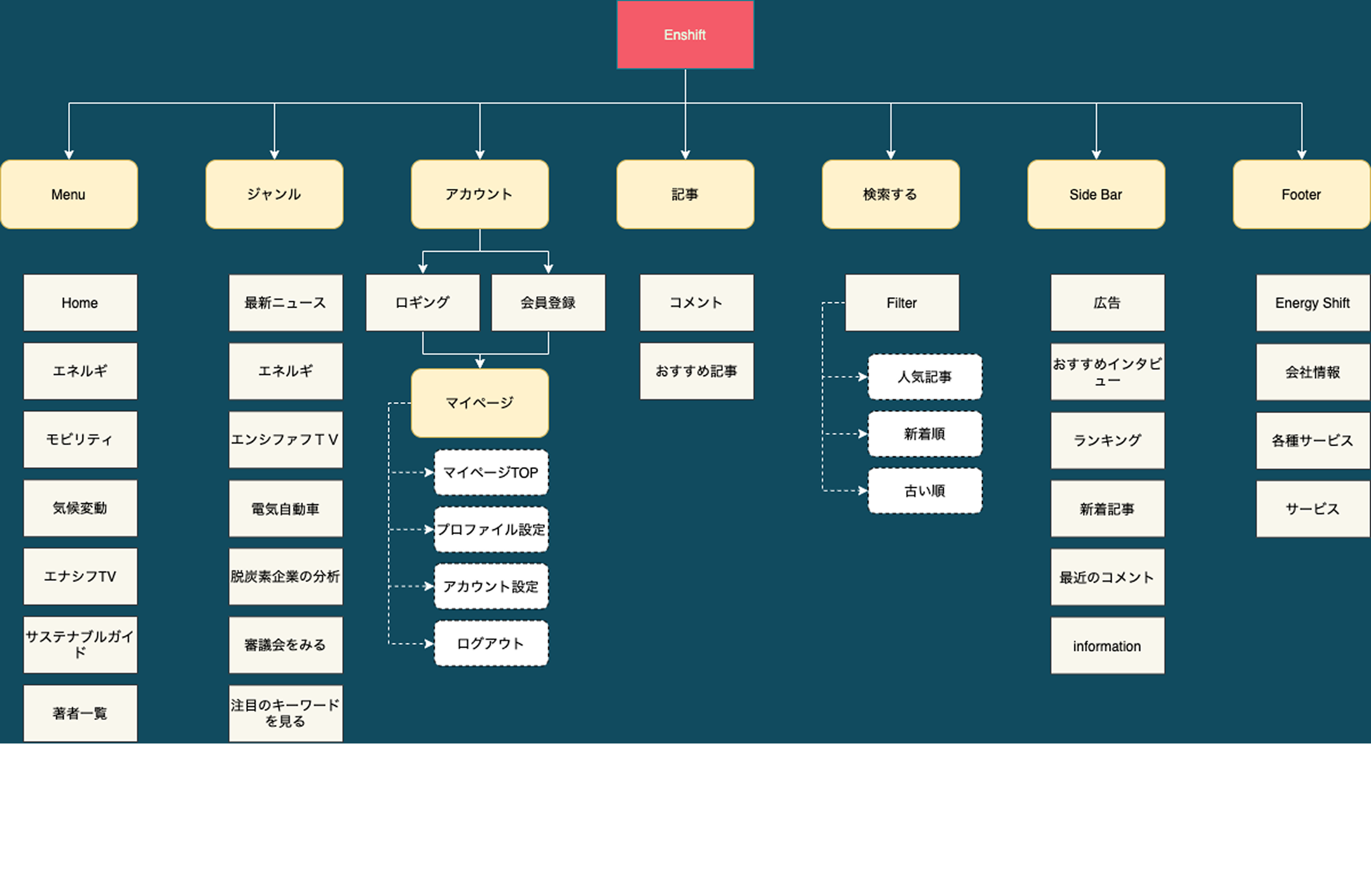
| Feature | Before | After | Evidence |
|---|---|---|---|
| Bottom navigation | 3 items: Home · My Page · Settings | 4 items: Home · Search · Ranking · My Page | 5 competitor apps |
| Search | Buried in content flow, not always reachable | Permanent primary nav slot, with category filter | Comp + reviews |
| Home screen | Single flat list of all articles | Category tabs + sub-category drill-down | SAGE/MIT |
| Ranking tab | Did not exist | New — surfaces trending articles users didn't know to search for | 5 competitor apps |
| Icons | Custom set — required learning | Standard iOS/Android news-app patterns | UX convention |
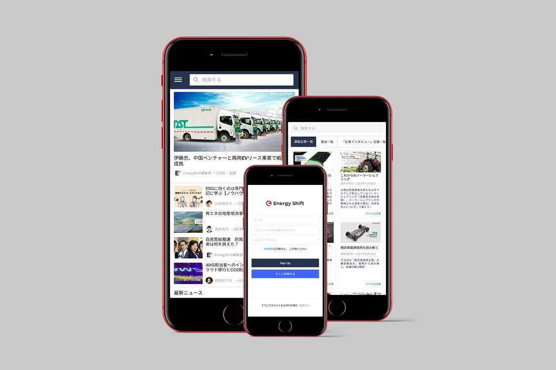
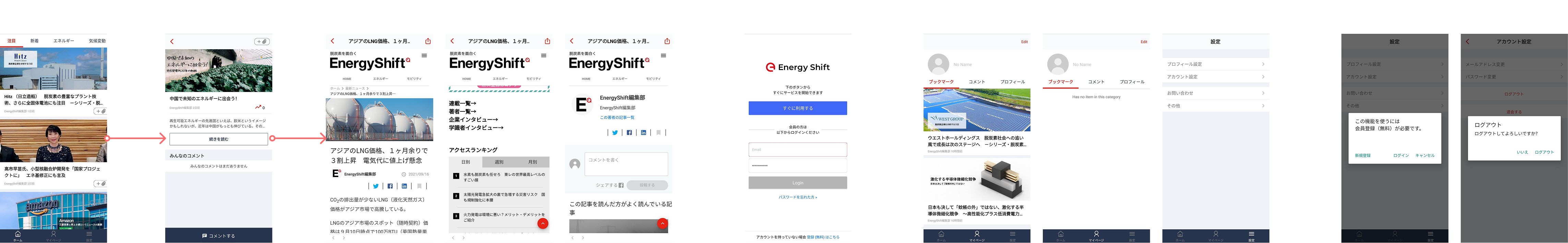
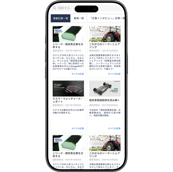
Before / After
Three nav items became four. Search and ranking came out of hiding.
Before — what users experienced
- — Open app → don't know where to start
- — Looking for solar news → scroll through everything
- — Search buried — hard to reach when needed
- — Icon meanings unclear — have to guess
- — No trending feed — discovery is hard
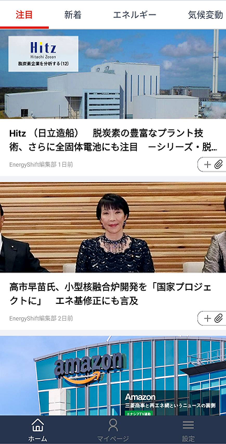
After — what users experience now
- — Open app → familiar layout, no learning needed
- — Tap "Solar" tab → only relevant articles
- — Search always visible in bottom nav
- — Standard icons — understood instantly
- — Ranking tab — discover trending without searching
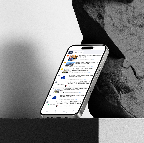
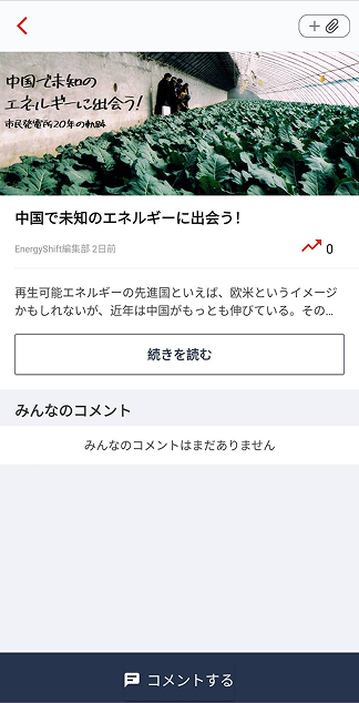
Before — original screens
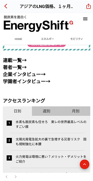
After — redesigned
05 / Outcome
Approved at the final presentation and moved to implementation.
3.5★
Root cause identified — diagnosed from reviews and directly addressed.
5
Competitor apps analyzed; every major decision backed by pattern evidence.
3
Structural problems diagnosed, each with a clear cause-and-fix chain.
06 / What I Learned
Four months without user interviews — what it taught me.
01
Reviews are a research dataset — if you read them structurally
I had no user interviews, so I used 1-star reviews as my primary source. The trick wasn't reading for sentiment. It was looking for phrases that repeated across different users. Repetition = signal worth investigating.
02
You can't fix what you can't see — draw the structure first
The navigation problems were invisible when I was just using the app casually. The moment I drew the IA diagram, the issues became concrete and explainable. Mapping always comes before designing.
03
Using familiar patterns is a design decision, not a shortcut
I chose standard news-app navigation because the research pointed to it. When five apps independently arrive at the same structure, that's strong evidence users already understand it. Convention can be your research.
04
A proposal that traces back to evidence wins every time
The PM approved it not because it looked great — but because every decision had a traceable reason. "I can explain why" is more persuasive than "trust me, it's better."