Evomo × Prochiz · 2022 · B2B SaaS
Closing the two gaps that kept Prochiz on Excel.
Rethinking how machine stoppages become decisions, inside Evomo's existing screens.
Role
UI/UX Designer
Timeline
2 sprints · Mar–Jun 2022
Client
Cheese mfg · B2B SaaS
Focus
Loss calculator & Issue tracker
Overview
Evomo is an IoT platform that watches factory machines through sensors. Its client, Prochiz — a major Indonesian food manufacturer specializing in cheese — could see exactly when any machine stopped.
But when I read Prochiz's monthly reports, two columns stood out — numbers Evomo should have known, filled in by hand. They were paying for a monitoring platform, and still running on Excel.
This case study is about the two features that closed that gap — without adding a single new page.
00 / The Platform Today
Sensors on the machines, dashboards for the managers.
Prochiz — a major Indonesian food manufacturer specializing in cheese products. Multiple production lines run daily, so a machine sitting idle for even an hour means thousands of products never get made.
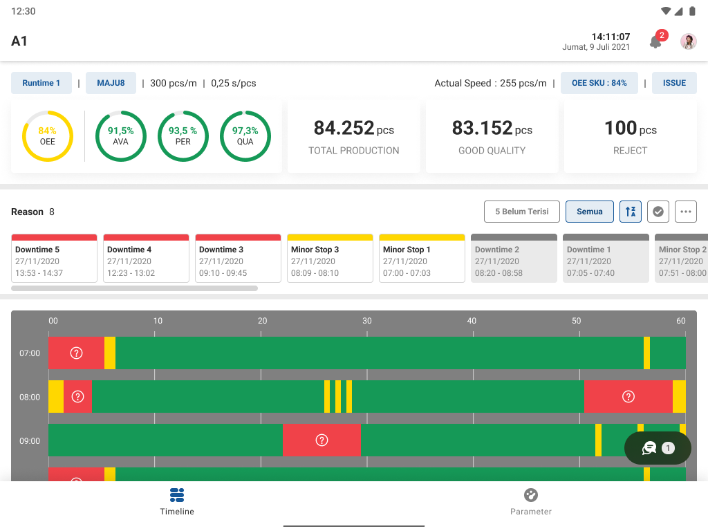
OEE is basically a factory's report card — a single 0–100% score for how well its machines are running. 100% means no stoppages, no defective products, running at full speed. From here on, this page just calls it the performance score.
How Evomo works — three steps
Sensors record everything
A sensor on every machine logs when it stops and starts — nobody types anything in.
The dashboard shows what stoppages cost
Causes of stoppage are ranked by how much production they cost, updated in real time.
Managers decide what to fix first
The Plant Manager uses this data to pick what gets fixed first — and reports it to the board weekly. This is the step where this project's gaps were found.
Watching machines
Stops and restarts are logged by sensors. The dashboard is always current.

Ranking downtime causes
Every cause of stoppage, sorted by how much time it took.
What a stoppage costs
Shown nowhere. Calculated by hand every month.
Who's fixing it
No assignment, no record. Managed in Excel.
Evaluation summary
Evomo is genuinely good at watching machines. What's missing is the decision layer: what a stoppage costs, and who acts on it.
01 / The Pain Points
Every month, two numbers were still being made by hand.
I didn't start by asking anyone what they wanted — people describe what they think they do, but their paperwork shows what they actually do. So the first thing I asked Prochiz for was the paperwork: monthly reports, stoppage logs, production spreadsheets. Five gaps stood out. And when I sat down with the Plant Manager and the Engineer, the same two kept coming up — the two that cost the most. Those became the project.
Prochiz's weekly downtime report — recreated from the real Line 2 sheet
.xlsxDaily OEE & losses block — Speed × Output (pcs), loss minutes, OEE %
✎ All Excel formulas — rebuilt and maintained by hand, every week.
| Downtime cause | Min | Freq | % | BFinding problem | BCorrective action (CAPA) |
|---|---|---|---|---|---|
| Mesin PFM mati/stop | 190 | 6 | 2.2% | ✎ Shift 1: PFM chain snapped; packaging kept coming loose after the replacement | ✎ EGD team reset the home axis manually while running — WO:00500 |
| Trouble heater upper/lower crimper | 80 | 3 | 0.9% | ✎ Upper crimper alarm — target temperature never reached; thermocouple suspected | ✎ Replaced the thermocouple (WO:00498); swapped the temperature control next day |
| Force majeure (gempa) | 30 | 1 | 0.3% | ✎ Earthquake at 16:00 | ✎ Evacuated the staff |
This report already existed at Prochiz — it's what the Board and managers discuss every week. The causes, minutes, and frequencies are already bridged by Evomo and analyzed by Prochiz. What had no bridge were the colored parts: the loss calculations (A), and the record of how each downtime was fixed and prevented — the CAPA (B).
Losses weren't calculated
“Every stoppage in the report needs a lost-production figure. Evomo doesn't calculate it — someone works it out in Excel before every review.”
Confirmed in the interview with the Plant Manager
→ Closed by Feature 03 — Expected Losses
No owner, no tracking, no record
“When downtime happens, there's no way to record how it was fixed or how we prevent it — no CAPA. So the weekly report for the Board gets rebuilt by hand.”
Confirmed in the interview with the Engineer
→ Closed by Feature 04 — Problem Tracker
Also found — parked for later
No way to set performance targets
— real, but little effect on losses
Reports exported manually
— mostly disappears once Problem B is solved
Yield data typed by hand
— a separate workflow, low impact
02 / The Design
Two problems, one decision: make the record that already exists do the work.
Put side by side, the two gaps turned out to be one problem: inside Evomo, a stoppage was just a passive log entry. It didn't say what it cost. Nobody owned it. So instead of building two separate tools, I gave that one record two jobs — in the order the factory experiences them: first show the loss, then get someone on it.
Problem A
Losses weren't calculated
A stoppage was described in minutes — nobody knew what it cost.
Problem B
No owner, no record
No one was assigned, nothing was logged, reports were rebuilt by hand.
One solution
Redesign the stoppage record so it carries everything.
Its predicted loss in pieces — calculated automatically
Its owner and fix — assigned and logged
Monthly and weekly reports build themselves from those records
Problem A — Losses weren't calculated
Expected Losses
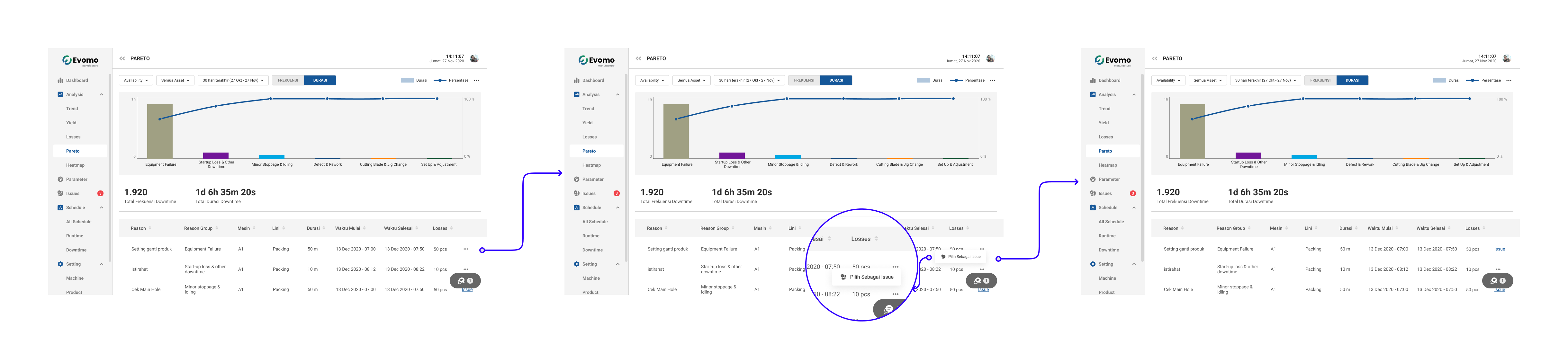
Give every stoppage a predicted number — how many pieces it costs — inside the list managers already check every day.
Gap addressed — counted by hand, every month
The monthly report requires a lost-production figure for every stoppage, and someone worked it out in Excel every month. This column makes the prediction automatic — and keeps superadmins and managers aware of how much production is at risk.
Quick math: this line normally makes 8–9 pieces a minute. A machine goes down for 40 minutes — how many pieces never get made?
Tap an answer
The ranked list of downtime causes, with the new "pieces lost" column highlighted. The number appears on the screen managers already check every morning — no new habit to learn.
One column, not a new page
Every number needed — how long the machine was down, how fast it normally runs — already existed in the system. A new report page would cost one extra click, every time. A column in the list people already use means the answer is just there.
The number is shown in pieces, not money — because that's how Prochiz's own reports are written. A small but deliberate choice to match the format they already report in.
Feature 03 answers "how much production is this stoppage costing?" — Feature 04 answers "who's fixing it, and did it get fixed?" Same stoppage record, same screen, one flow.
Problem B — No owner, no record
Problem Tracker
Turn every stoppage into a task someone owns. A person gets assigned, the fix gets logged — and the weekly report builds itself from those records.
Gap addressed — the weekly Excel ritual
Every week, someone rebuilt the Board's report by hand in Excel. This feature doesn't add a new task — the moment someone logs the corrective action (the CAPA), that record becomes the report.
From problem to report — both features in one flow
01
Problem occurs
Machine stops, stoppage is logged automatically
02
Loss quantified (Feature 03)
Predicted pieces lost, calculated automatically
03
Someone assigned (Feature 04)
A tracked task is opened and they're alerted
04
Weekly report
Resolved problems roll up automatically, per line
A flow, not a screen
Nothing in Evomo connected "a machine stopped" to "someone fixed it, and there's a record." So before drawing any UI, I mapped the chain of responsibility — who reports, who assigns, who fixes, what trace is left — and then gave each step a screen.
One stoppage, start to finish
To see how the flow actually works, follow one incident: it's 09:14, and machine B-2 on Line 101 just stopped.
Floor staff — reports it
Machine B-2 stops. The sensor has already logged it — all the floor worker does is explain why.
1The stoppage is already on the dashboard
%20-%20dashboard-DHkPxRFE.png)
2Pick a reason, add a note, submit
%20-%20input%20reason-b0OAXNjX.png)
Timestamps come from the sensor automatically. Manual entry stays possible for the rare exception.
Superadmin (supervisor)
The supervisor spots the stoppage — by now it's already cost ~150 pieces. They mark it as an issue and assign a technician.
1Sees what each stoppage cost
2Marks it as an issue
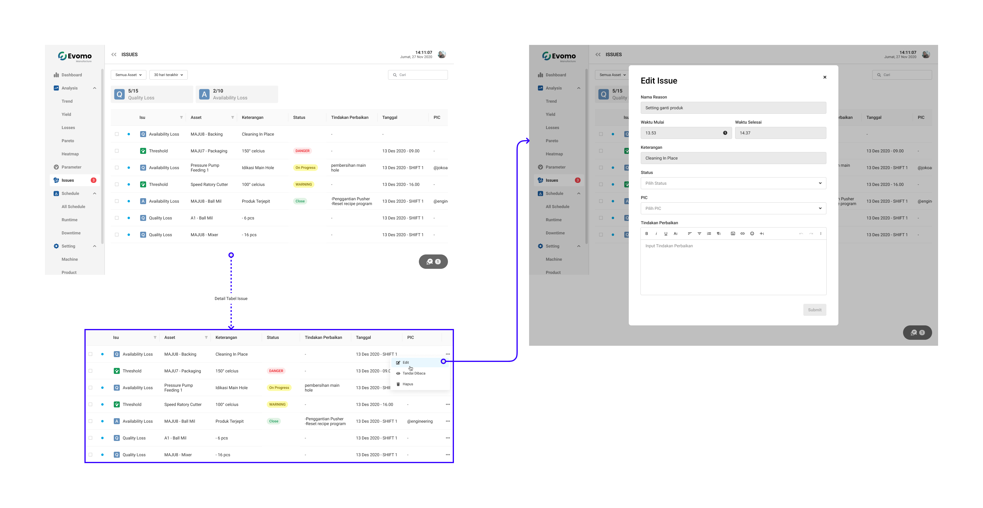
3Assigns a technician, writes instructions
Floor staff — fixes it
The technician got the notification, fixed the machine, and logs what they did. The moment it's closed, the weekly report already has everything it needs.
1Gets the notification
%20-%20notifikasi-CDtv2TAo.png)
2Opens the task, marks it In Progress
%20-%20issue%20list-BqEp_DsC.png)
3Logs the fix, closes it
%20-%20edit%20issue-BpFZyTUm.png)
Prototype walkthrough
Why this flow works: every step starts from something the user already sees — a stoppage on the timeline, a notification, an item in a list. Nobody has to remember a new process for the tracker to stay up to date.
Design decisions
Reporting a problem starts from the ranked cause list, not a separate page
The cost figure stays on screen the whole time someone is logging the problem. A separate page would make them lose that context.
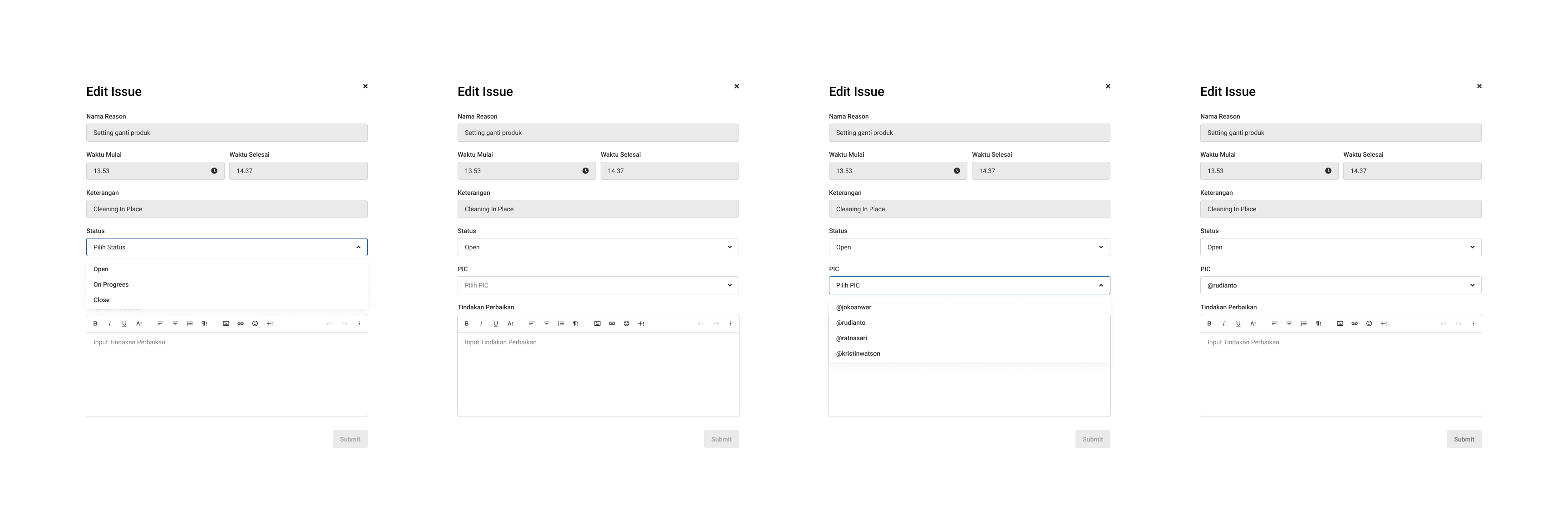
Supervisor marks it 'Open' before assigning anyone
"Open" means "I've seen this and it's real" but not yet assigned. Skipping straight to assignment skips a useful accountability step.
Floor staff are alerted by notification, not by checking a dashboard
People on the floor aren't sitting in front of a screen all day. A notification is the only reliable way to reach them.
Only three status options
Everyone interviewed used exactly these three states in practice. A 'pending approval' state didn't reflect how they actually worked.
Records are tied to the person on shift, not just the production line
Same line, different shift, different person, different context. This makes it possible to say whose shift something happened on in the weekly report.
Closed problems feed back into the trends view
Closing a problem isn't the end of the story — each one becomes data for prioritizing the next round of fixes.
One deliberate detail: reporting a problem starts on the same screen as Feature 03's loss column. The "how many pieces" number is still visible while deciding who fixes it — so the two features become one decision flow.
03 / What Changed
What changed for Prochiz.
A quick recap: losses were counted by hand every month, and a report was rebuilt in Excel every week. Here's the same work, after.
| Job | Before | After |
|---|---|---|
| Working out how much a stoppage cost | Calculated by hand | Shown automatically on the ranked cause list |
| Tracking problems & building the weekly line report | Paper logs plus an Excel report rebuilt weekly, per line | Stoppage → tracked task → person notified → weekly report generates itself |
Plant Manager — weekly BoD presentation
The Plant Manager presents how each production line is doing to the Board of Directors every week. Before, that meant pulling numbers from two different tools into one slide deck. Now, everything needed comes from Evomo alone.
Loss calculator
The predicted loss of each stoppage — in pieces — is right there on the ranked cause list. No side calculation needed.
Issue tracker
The weekly summary shows what broke, who fixed it, and what they did about it — for every line. No Excel involved.
04 / Defining Success
If I shipped this again, here's what I'd measure.
The honest part first: the plan for these features included success metrics, but they were never actually measured after launch. It's my biggest miss on this project. If I shipped this again, I'd track them from day one — but before I show you mine: what would you pick?
If you shipped this, what would you track first?
Pick 2–3 metrics you'd prioritize.
Closing
If this project taught me one thing, it's to start with a client's paperwork before their opinions. I knew nothing about factories going in — but the answers were sitting in Prochiz's spreadsheets the whole time. Thank you for reading!