Case study · Event booking platform, 2025
PIARY: Redesigning a Weekend Event Booking Flow Using Platform Data
Redesigned the homepage booking flow for Pia Machicon using 3 months of booking log analysis — from data review through Figma and into production React/TypeScript. Pia Machicon is a booking platform by PIARY Inc. for Machicon — organized group dating events held across Japan. I owned this project end-to-end: from initial data analysis and Figma prototyping through to the production React/TypeScript implementation that shipped.
Role
Designer + engineer (solo)
Timeline
Aug – Sep 2025
Tools
Figma · React · TypeScript
Shipped
Live in production
Process
Discover→Hypothesize (JTBD)→Design & Ship→Measure & Reflect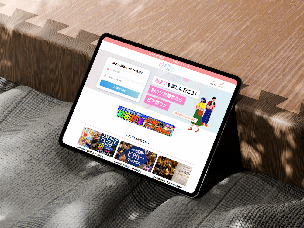
01 / Problem
Discovery started with booking data, not wireframes.
The original brief was to improve the booking flow, with no defined scope. Before sketching any solutions, I pulled three months of booking logs — 192 bookings — to understand how the platform was actually being used. The data showed that 83.3% of events fell on weekends, yet the search flow treated every day equally. The form wasn't built for how most users were actually using the platform.
Events held, by day of week
Sat 55 · Sun 35 — weekends make up 83.3% of events
When bookings are actually made
59.3% of bookings happen on weekdays
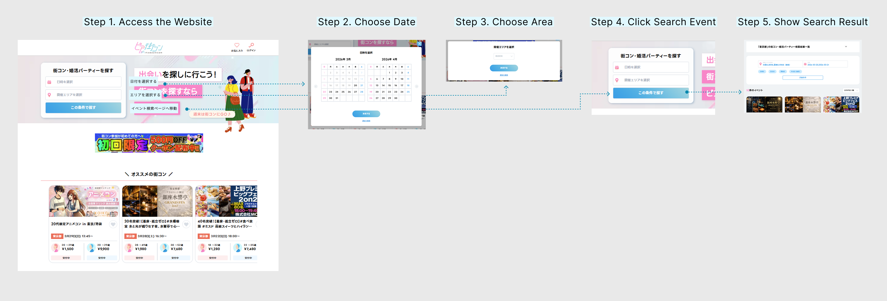
The 5-step search form wasn't just slow — it was built for the wrong user. Every visit, the 83% majority absorbed the full friction of a workflow designed for the 17% minority.
What users had to do
Five steps, repeated on every visit.
02 / Hypothesis: Jobs-to-Be-Done
Applying the Jobs-to-Be-Done framework revealed two distinct use cases that the existing flow didn't account for.
I applied Clayton Christensen's Jobs-to-Be-Done (JTBD) framework and found that users were "hiring" this app for two very different jobs.
The Minority Job
(Exploratory)
The Majority Job
(Expeditionary)
User's job
"Let me browse a wide catalog for future dates."
"It's Wednesday; help me lock in my Saturday plans now."
Old UI fit
03 / Alternatives Considered
Three alternative approaches were evaluated before the final direction was decided.
Add a "Weekend" Filter to the Form
Opening the form is the friction. Adding a checkbox doesn't fix that.
Saved Search Presets
Requires too much setup. Users' behavior was closer to "first-visit" intent every time they logged in.
Redesign the Calendar UI
This makes the "browse and explore" model prettier, but it doesn't make the "expeditionary" job faster.
✅ The Adopted Solution
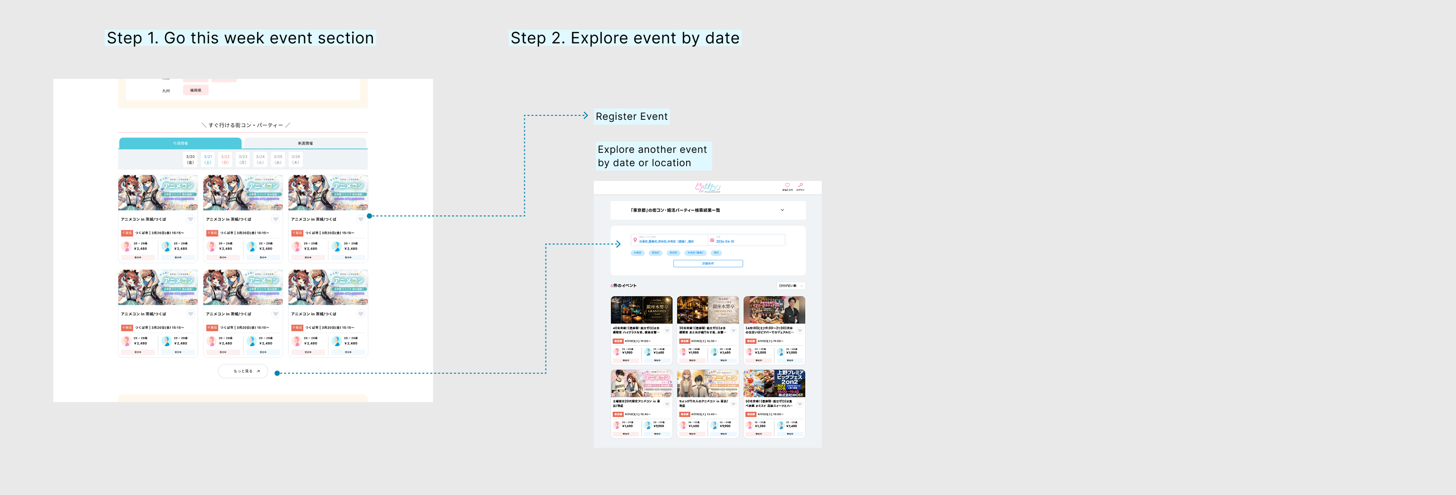
The "Go This Weekend" Section
I implemented a dedicated, auto-populated section on the homepage. Using geo-location and session data, the app now greets the user with: "Here is what is happening in [Your City] this Saturday."
04 / Solution
I added a dedicated "Go This Weekend" section to the homepage. Here are the three design decisions behind it.
Intelligent Scoping
The Setup
Two simple tabs: "This Weekend" and "Next Weekend."
The Reason
Data confirmed the vast majority of bookings occur within a 7-day window. Showing events 3–4 weeks out created unnecessary noise.
The Goal
By narrowing the inventory to a two-week window, I limited choices to a scannable dozen per tab. This applies Hick's Law — reducing the number of options to decrease the time it takes for a user to make a decision.
Zero-Input Context
The Setup
Automated area detection.
The Reason
Forcing a user to tell us where they are is a friction point.
The Logic
Guest users are defaulted to Tokyo (our highest-volume hub), while logged-in users are automatically shown events in their registered area. Relevant inventory is visible the millisecond the page loads — moving from "Search" to "Discovery" instantly.
Scannable vs. Input-Driven UI
The Setup
Information-dense, high-contrast event cards.
The Reason
When the goal is speed, users shouldn't have to click into a detail page to see if an event is "worth it."
The Logic
I prioritized four key data points: Event Name, Date, Area, and Real-time Availability (remaining spots). The interaction model shifted from a "filter-down" process to a "choose-at-sight" experience.
05 / Why this placement
The homepage was already working. Adding something new meant finding a spot that wouldn't break what was already there.
The "Popular Area" section already puts a city in the user's head. Placing "Go This Weekend" right after it means the moment they think "Tokyo," they see what's actually happening there this Saturday.
"Popular Keyword" stays below it — for people who still want to browse. The new section only steps in for the person who's already ready to decide.

Before
After
Four reasons for the placement
01
Answer the question they're already asking.
When someone taps "Browse by Popular Area," they have already decided where they want to go. The next natural question is: "Okay, so what is happening there this weekend?" By placing the new section directly below, I give them that answer immediately, so they don't have to ask the same question again using a search form.
02
Don't move what is already working.
The search bar, banners, and recommendations at the top of the page were already doing their job well. Putting something new above them would push those useful tools down and risk confusing people who are used to the current layout. Adding it to the middle of the page provides a shortcut without taking anything away or breaking the existing flow.
03
Reach people before they leave the page.
Even though 83.3% of bookings are for weekend events, users can only book them if they actually see them. Most people stop scrolling and leave the page before they reach the bottom. I placed this section in the middle because that is where most users are still paying attention. If I had placed it any lower, many users would have missed it entirely.
04
Follow the natural flow of the page.
Scrolling down the page feels like narrowing down your choices: you start with general recommendations, then filter by place, and finally filter by both place and time. Adding "Go This Weekend" at this specific point feels like the next logical step in a conversation, rather than a random interruption.
06 / Outcome & an honest note on measurement
Feature shipped Sep 2025. Booking behavior changed — with an honest note on what the data shows and what it doesn't.
I compared 108 bookings pre-launch against 87 post-launch and identified three behavioral signals pointing to a shift in how users discover and book weekend events.
The planning shift
Same-day booking rate
Before
41.1%
After
23.1%
↓ 18pp
Median booking lead time
Before
1 day
After
4 days
↑ +3 days
Users stopped rushing on Saturday morning. Same-day bookings dropped from 41% to 23%, and for weekend events specifically, median lead time moved from 2 days to 6 — exactly the behavior the "This Weekend" tab was designed to support.
Cancellation improved — once decomposed
The headline cancellation rate went up. But splitting it by cause tells a completely different story.
User-initiated cancellations
↓ improvingBefore
21.1%
After
13.5%
The total rise was driven by the organizer side — nothing to do with the booking experience.
“Measurement is a design deliverable. It belongs in the spec, not in the retrospective.”
— Reflection on measurement
The takeaway
Define the measurement plan before shipping — not after. Three things I would instrument from day one:
Booking conversion through the weekend section specifically — not just overall volume.
Cancellation type in the data schema — user-initiated vs. organizer-delisted, separated at the source.
Booking lead time as a dashboard metric — the strongest signal, discovered months too late.
07 / Learnings
Four things this project taught me.
Data finds the question. Frameworks find the answer.
The 83.9% weekend stat told me something was wrong. It didn't tell me what to build. That answer came from asking "what job is this product being hired to do?" — not from the spreadsheet.
Equal treatment is not always fair treatment.
The old search form gave every user the same five steps. In practice, the 83% majority did the most unnecessary work on every visit. Designing a shortcut for most people — while keeping the full path for the rest — turned out to be the more respectful choice.
Aggregate metrics can hide the truth.
Total cancellations went up after launch. If I had stopped there, I would have called it a failure. Breaking the number into user cancels vs. organizer delists revealed that the UX was actually working. Every metric worth reporting deserves to be decomposed by cause.
Ship the measurement plan with the feature.
The strongest success signal — the shift in booking lead time — was something I discovered in a retrospective, not something I tracked from the start. Next time, every spec I write will include a "how we know this worked" section before a single component is built.